back to sitemap
click on an image to see that version live
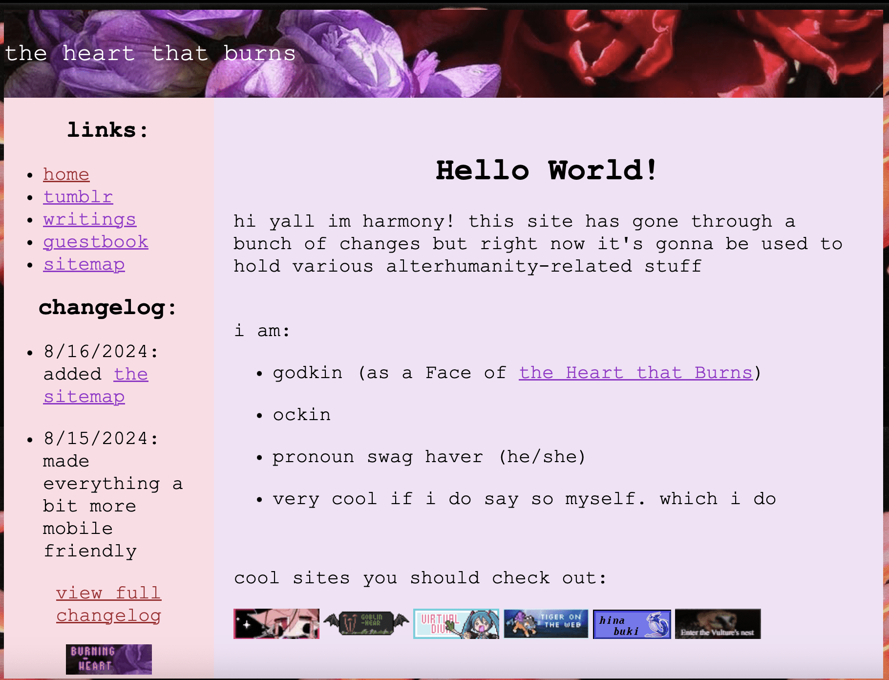
version 1: thorns and roses
the beginning of this site as it is now! this was quickly whipped up after a url change by staring at the code of sadgrl's layout builder.
very basic- i didn't really understand how divs or flexbox worked. it's not bad visually, but it's just not what i wanted from the site.
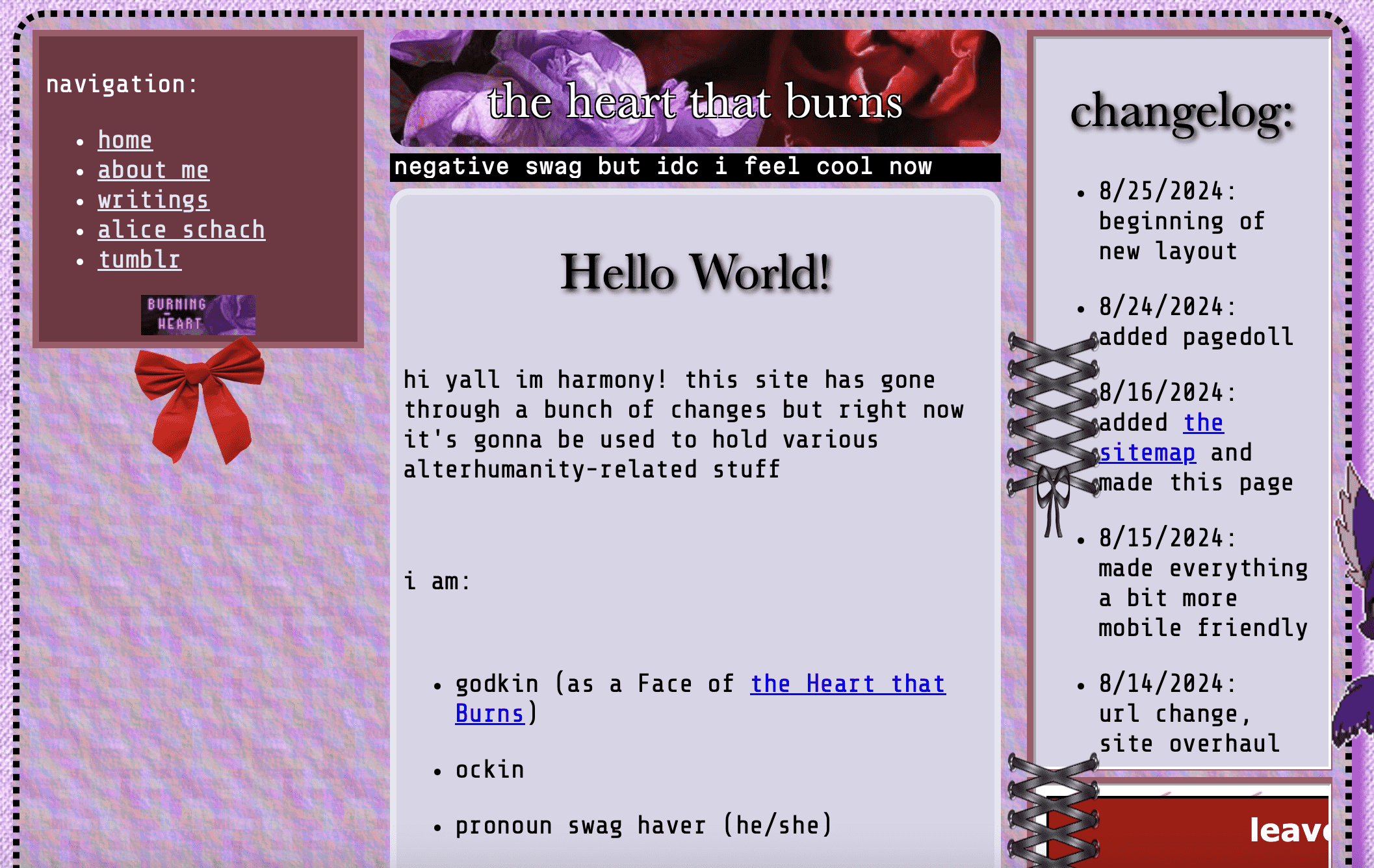
version 2: scrapbook
i distinctly remember having to fight flexbox to make the header not span the whole container. this layout was way more difficult than it needed to be, because i overestimated my css skills just a litte.
it was my first attempt at putting more thought into the mobile layout, and it's servicable, but doesn't look that great or show the visual ideas behind the site.
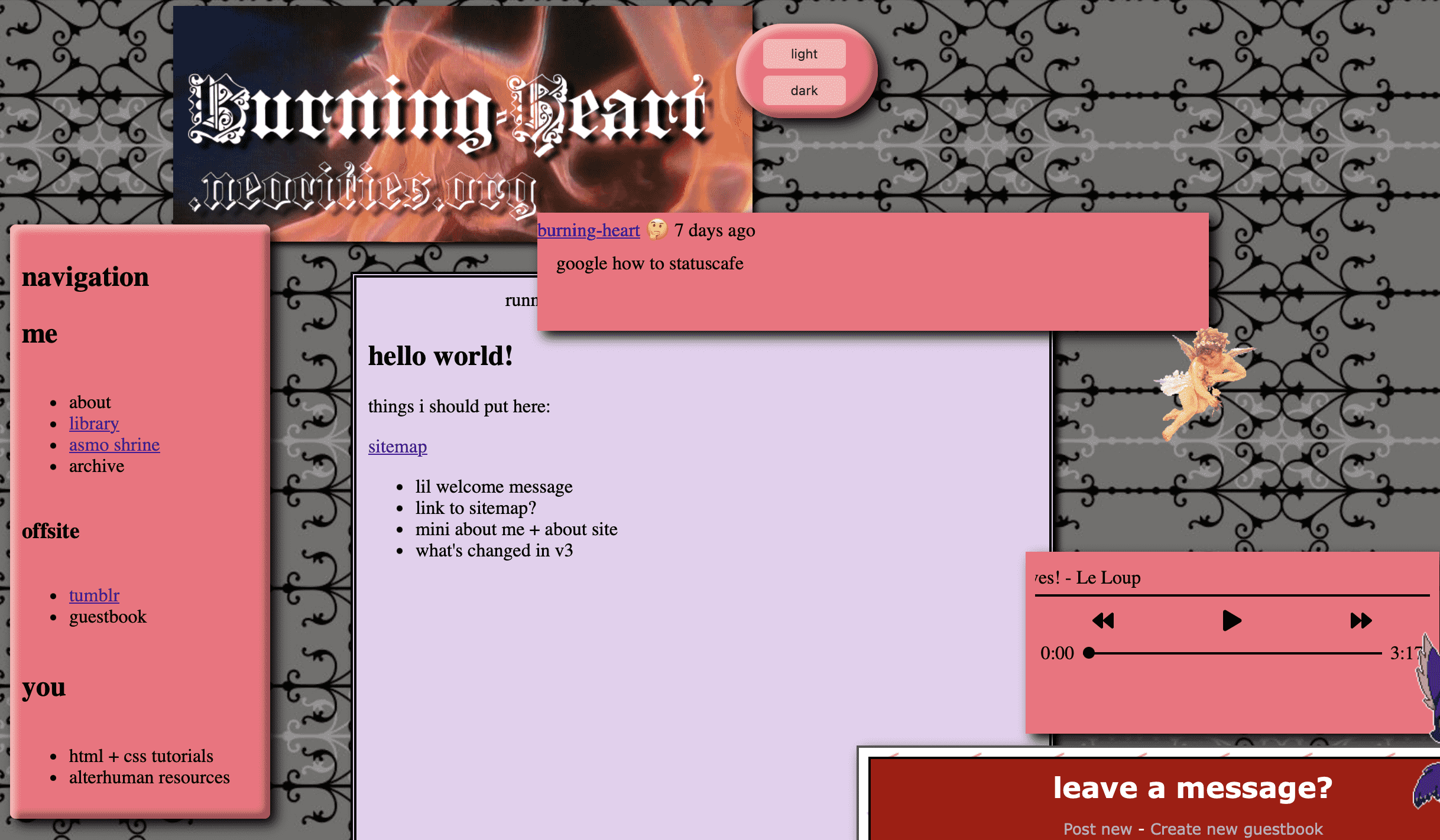
version 3: firey gates
the first gridbox layout! i had experimented with it previously, but this was where i actually got it working.
i learned a lot about how to make responsive layouts that still had that personal website swag. protip: use gridbox, code in safari, and define sizes with px, not % in the desktop layout.
version 4: simplicity
i've been experimenting with making simpler layouts, this version is when i decided to make that the actual site aesthetic
this is still a gridbox layout but it is SOO much easier to understand and edit